NuAxis
Innovations
Brand Refresh
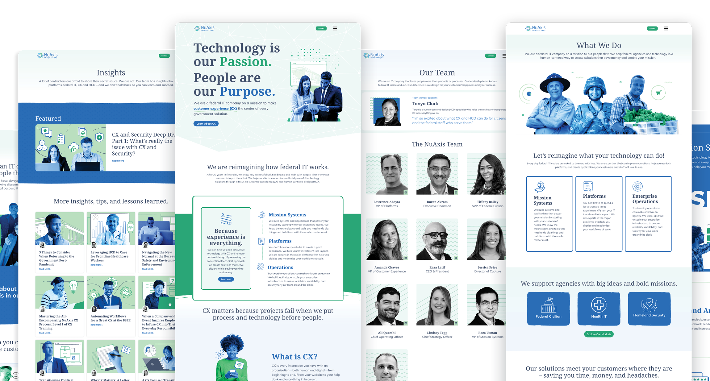
NuAxis made a strategic shift to focus on customer experience and human-centered design within federal IT. They needed a engaging new website to drive that message home.

About the Project
NuAxis Innovations is a tech company with a mission to put people first. After 20 years serving federal agencies as an IT contractor, the leadership team saw a gap in the way government delivered IT services to citizens and staff: in the rush to modernize, they often forgot about the people causing projects to fail before they started. NuAxis went all-in on customer experience (CX) and human-centered design (HCD), the principles driving some of the most successful commercial tech organizations in the world. They believed government could restore trust and build better products by embracing CX. They believed in it so much they restructured their company and brand around bringing customer experience to government IT, starting with a refresh of their website www.nuaxis.com. Because of this effort, NuAxis is becoming synonymous with helping government leaders modernize by pairing innovative technology with customer experience and human-centered design. From the Department of Labor to Capitol Hill, NuAxis has a reputation for helping government IT listen more, build faster, and create products that citizens love to use.
The Messaging
Updating your brand message is often easier said than done. We worked with NuAxis leadership, stakeholders, and clients to capture their passion for CX and HCD without losing the core capabilities.
The team created a flexible messaging framework with customer personas, brand characters, and detailed messaging that leaders, staff, and sales can use when creating web copy, press releases, capability statements and proposals. The new messaging is not only clear – it’s consistent across all NuAxis’ assets.
The Visuals
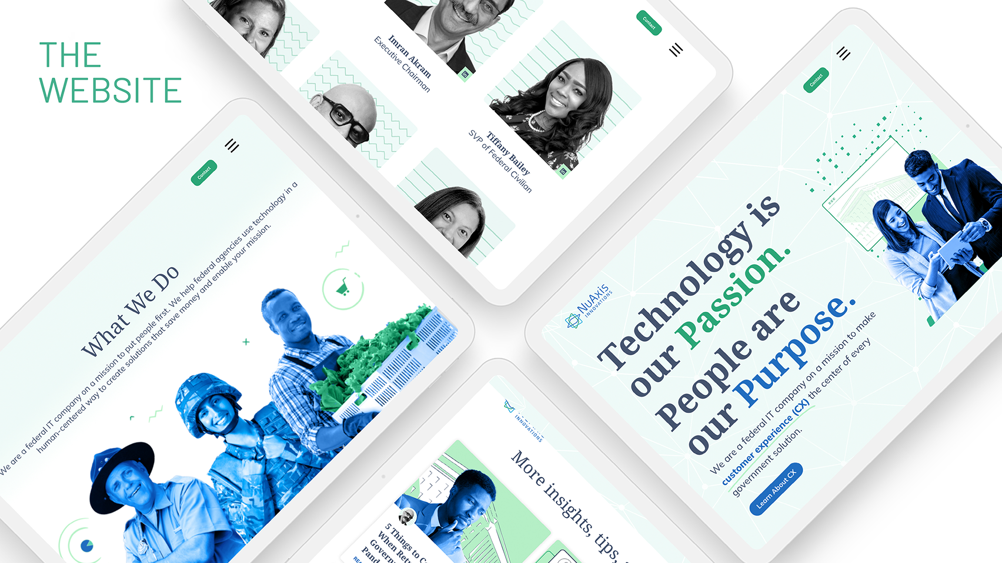
For the visual brand, we modernized their existing color palette, while strengthening the brand to better reflect the updated persona. We used a serif font paired with a modern san serif to soften their style and created a unique graphic style that represents their love of people and technology.

Hex: #206DC0
RGB: 32, 109, 192
CYMK: 85, 57, 0, 0
Hex: #2BA677
RGB: 43, 166, 119
CYMK: 78, 10, 70, 0
Hex: #B7F2C8
RGB: 183, 242, 200
CYMK: 27, 0, 29, 0
Hex: #46536F
RGB: 70, 83, 111
CYMK: 78, 66, 36, 19
Hex: #F0F6FD
RGB: 240, 246, 253,
CYMK: 4, 1, 0, 0
Hex: #EEFAF7
RGB: 238, 250, 247
CYMK: 5, 0, 3, 0


